Color
Approach
At our core, we believe in creating interactions and experiences that are inclusive. This means ensuring that all Red Hat digital properties are accessible to everyone.
Using color alone
When considering methods of communication or feedback, do not use color or location alone. Ensure there is text, an icon, an underline, or other visual cue to communicate meaning. Consider how these elements look to a color blind user.

Color contrast
Body and code text
Foreground body and code text (non-bold text under 24px and bold text under 19px) must have a contrast ratio of 4.5:1. Large foreground body and code text (non-bold text of at least 24px and bold text of at least 19px) must have a contrast ratio of 3:1.
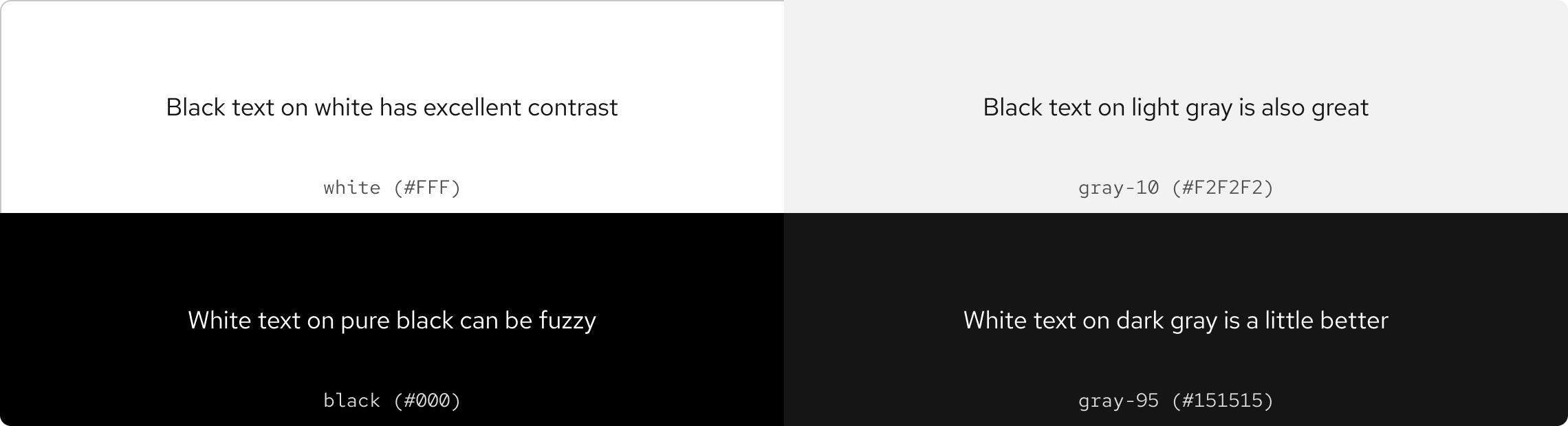
Red text on backgrounds
Our primary brand color is known as Red Hat red (#E00). It has many applications, but on the web, it does not pass color contrast against all background colors, especially text at small sizes.
If red text cannot be used, use dark gray or black text against lighter backgrounds, or light gray or white text against darker backgrounds. If you have questions about using other red colors, contact the Brand team.
Warning
Black is usually a brand-only color, but it can be used very sparingly for backgrounds only ifgray-95 cannot be used.
WCAG requirements
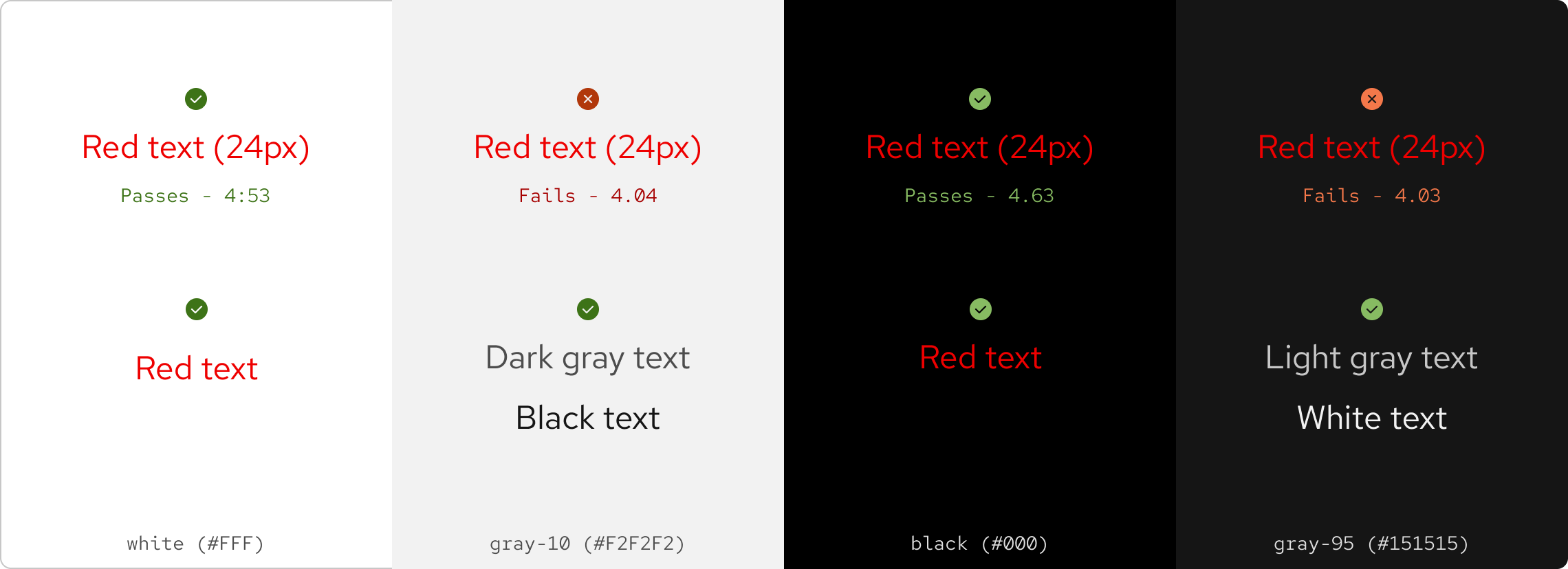
WCAG 2.0 level AA requires a contrast ratio of at least 4.5:1 for normal text and 3:1 for large text. WCAG 2.1 requires a contrast ratio of at least 3:1 for graphics and UI components like form input borders. Use the table below to confirm you are using color contrast correctly before using red text.
The font sizes that are considered normal and large are as follows:
- normal: non-bold text under 18pt/24px and bold text under 14pt/19px
- large: non-bold text of at least 18pt/24px and bold text of at least 14pt/19px
| Background color | Contrast ratio | Normal text | Large text | Objects and UI components |
|---|---|---|---|---|
white (#fff) |
4.53 | WCAG AA: Pass | WCAG AA: Pass | WCAG AA: Pass |
gray-10 (#f2f2f2) |
4.04 | WCAG AA: Fail | WCAG AA: Pass | WCAG AA: Pass |
gray-20 (#e0e0e0) |
4.04 | WCAG AA: Fail | WCAG AA: Pass | WCAG AA: Pass |
gray-70 (#383838) |
2.58 | WCAG AA: Fail | WCAG AA: Fail | WCAG AA: Fail |
gray-80 (#292929) |
3.21 | WCAG AA: Fail | WCAG AA: Pass | WCAG AA: Pass |
gray-90 (#1f1f1f) |
3.63 | WCAG AA: Fail | WCAG AA: Pass | WCAG AA: Pass |
gray-95 (#151515) |
4.03 | WCAG AA: Fail | WCAG AA: Pass | WCAG AA: Pass |
black (#000) |
4.63 | WCAG AA: Pass | WCAG AA: Pass | WCAG AA: Pass |
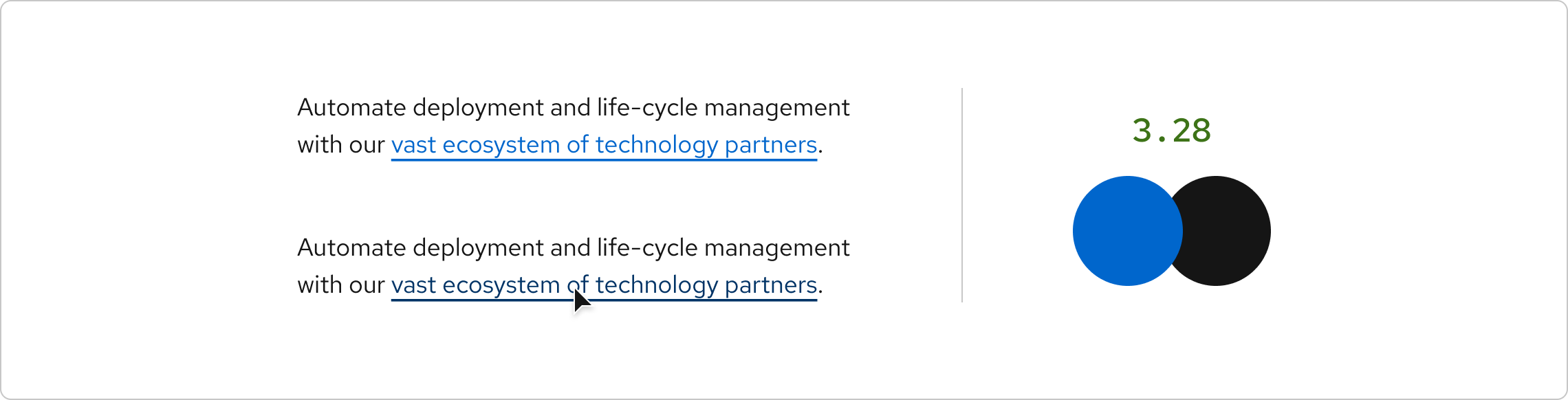
Links
To differentiate text links from their surrounding text without relying on color contrast, links in all states must be underlined. Links isolated within visually distinct sections (e.g., navigation menus) or with additional visual cues (e.g., CTA arrows) are exempt from this requirement, though you may still add underlines at your discretion.
Graphical objects and UI components
Graphical objects and UI components like charts and infographics should have a contrast ratio of at least 3:1. If color is the only way to distinguish between inline controls and surrounding text, the contrast ratio between the control and text must be at least 3:1.
- Non-color cues like borders must be used to signify when an element receives focus
Layering
You can layer colors on light or dark backgrounds. However, layering colors near or on top of other colors will cause vibration. For more information about layering colors, follow WCAG 2.1 AA requirements.

Tools
The Colour Contrast Analyzer by TPGi can help you identify colors and gauge their contrast from one another.
Other libraries
To learn more about our other libraries, visit this page.
Feedback
To give feedback about anything on this page, contact us.
Foundations
To learn how to use our other foundations in your designs, visit the foundations section.
